Packet Analysis with R (Part 1)
As a network security consultant I’ve spent a my fair share of time trawling through packet captures, looking for that clue or piece of evidence I hope will lead me to the root cause of a problem. Wireshark is the the tool par excellence for interpreting and investigating packet captures, however I’ve always found that it’s best suited to bottom-up rather than top-down analysis. Opening a packet capture you’re bombarded with information, the minutiae from each packet instantly available. This is perfect if you know what you’re looking for and can filter out the noise to concentrate on your problem. But if you don’t have a clear view of what’s in the capture, or where the problem may lie, taking a step back and removing yourself from the details in Wireshark can be difficult.
Recently, while reading Hadley Wickham’s R for Data Science book, the chapter on tidy data resonated with me. For the uninitiated, ‘tidy data’ is a method of organising columnar data to facilitate easier analysis. It can be summarised by three main properties:
- Each variable must have its own column.
- Each observation must have its own row.
- Each value must have its own cell.
What struck me was that this perfectly described packet captures: each captured packet being and observation, and the values of the dissectors the variables. I wondered whether analysis of packet captures could be done with R and be the top-down compliment to Wireshark’s bottom-up approach.
In this article I want to show how valuable it can be to perform packet analysis using the R language. It’s broken into three sections:
- Conversion of packet captures to columnar data.
- Creation of Wireshark analogies in R.
- Deeper dive into the packet captures.
There’s nothing too complicated in here: no regressions, no categorisation, no machine learning. It’s predominantly about filtering, counting, summarising and visualising aspects of packet captures. What I hope you will see is the power and usefulness in these simple actions.
PCAP to CSV Transformation
The first step is to convert the packet capture file into a format that R can ingest. I chose the comma separate values format (CSV) for its simplicity and human readability, however SQLLite and Parquet are other viable options.
We download a sample packet capture file and run a PCAP to CSV conversion script I’ve written over the top of it:
packet_capture <- './sample.pcap'
pcap_to_csv <- './pcap_to_csv'
# Download the sample packet capture
if (!file.exists(packet_capture)) {
    download.file(
        url = 'https://tinyurl.com/h545tup',
        destfile = packet_capture
    )
}

# Download the PCAP to CSV script to the CWD.
download.file(
    url = 'https://tinyurl.com/utdbj44',
    destfile = pcap_to_csv
)
At a high level the script performs the following actions:
- Spawns a
tsharkprocess which runs over the packet capture, outputting the specified fields in JSON format to STDOUT. - Reads the JSON from STDOUT and flattens the data structure.
- Outputs all of the fields as CSV.
Spawning the tshark process and reading from STDOUT is not the cleanest of implementations, but it does the job we need it to do.
time perl pcap_to_csv sample.pcap
## Gathering dissectors...
## Extracting packets...
## Decoding JSON...
## Flattening packets...
## Creating sample.pcap.csv
## perl pcap_to_csv sample.pcap  17.33s user 0.79s system 101% cpu 17.774 total
What’s the size differential?
ls -lh sample.* | awk '{ print $5, $9 }'
## 9.1M sample.pcap
## 101M sample.pcap.csv
We see there’s about a 10:1 size ratio between the CSV and the original packet capture.
This CSV file is then ingested into R and some mutations are performed:
- We remove the ‘.0’ from the end of variable names. This allows us to refer directly to variables that are only in a frame once, e.g.
pcap['tcp.dstport']instead ofpcap['tcp.dstport.0']. - The
frame.timefield is changed to aPOSIXctdate-time class rather than a simple character string.
library(glue)
library(tidyverse)
library(kableExtra)

# Ingest the packet capture
pcap <-
    glue(packet_capture, ".csv") %>%
    read_csv(guess_max = 100000)

# Remove the ':0' from the column names
names(pcap) <- names(pcap) %>% str_remove('\\.0$')

# Update the frame.time column
pcap <-
    pcap %>%
    mutate(frame.time = as.POSIXct(
        frame.time_epoch,
        tz = 'UTC',
        origin = '1970-01-01 00:00.00 UTC'
    ))
Taking a look at some of the key variables in the first 10 rows:
# First peek
pcap %>%
    select(
        frame.time,
        ip.src, ip.dst,
        tcp.dstport, tcp.stream
    ) %>%
    slice(1:5)
## # A tibble: 5 x 5
##   frame.time          ip.src        ip.dst        tcp.dstport tcp.stream
##   <dttm>              <chr>         <chr>               <dbl>      <dbl>
## 1 2011-01-25 18:52:22 192.168.3.131 72.14.213.138          80          0
## 2 2011-01-25 18:52:22 72.14.213.138 192.168.3.131       57011          0
## 3 2011-01-25 18:52:22 192.168.3.131 72.14.213.102          80          1
## 4 2011-01-25 18:52:22 192.168.3.131 72.14.213.138          80          0
## 5 2011-01-25 18:52:22 72.14.213.102 192.168.3.131       55950          1
Wireshark Analogies
Now that we’ve got our data in to R, let’s explore it. To start with we’ll emulate some of the native outputs of Wireshark.
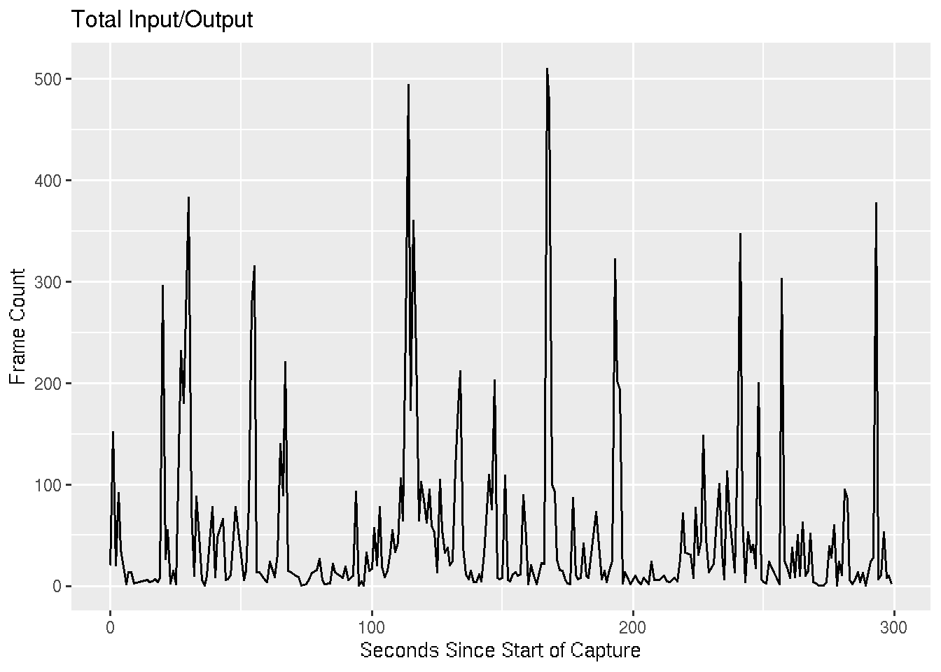
I/O Graph
This is the default graph you would find by going to [Statistics -> I/O Graph] in Wireshark. We round the each frame’s time to the nearest second and tally up the number of frames occurring within each of these seconds.
pcap %>%
    group_by(t = round(frame.time_relative)) %>%
    tally() %>%
    ggplot() +
    geom_line(aes(t, n)) +
    labs(
        title = 'Total Input/Output',
        x = 'Seconds Since Start of Capture',
        y = 'Frame Count'
    )
IP Conversations
This is similar to the output you would get by going to [Statistics -> Conversations -> IP]. We group by source and destination IP address and count the number of packets and the number of kilobytes in each of these unidirectional IP conversations.
pcap %>%
    group_by(ip.src, ip.dst) %>%
    summarise(
        packets = n(),
        kbytes = sum(frame.len)/1000
    ) %>%
    arrange(desc(packets)) %>%
    head()
## # A tibble: 6 x 4
## # Groups:   ip.src [5]
##   ip.src        ip.dst        packets kbytes
##   <chr>         <chr>           <int>  <dbl>
## 1 65.54.95.68   192.168.3.131    1275 1719.
## 2 204.14.234.85 192.168.3.131    1036  957.
## 3 65.54.95.75   192.168.3.131     766  879.
## 4 192.168.3.131 204.14.234.85     740  478.
## 5 192.168.3.131 65.54.95.68       664   66.9
## 6 65.54.95.140  192.168.3.131     658  763.
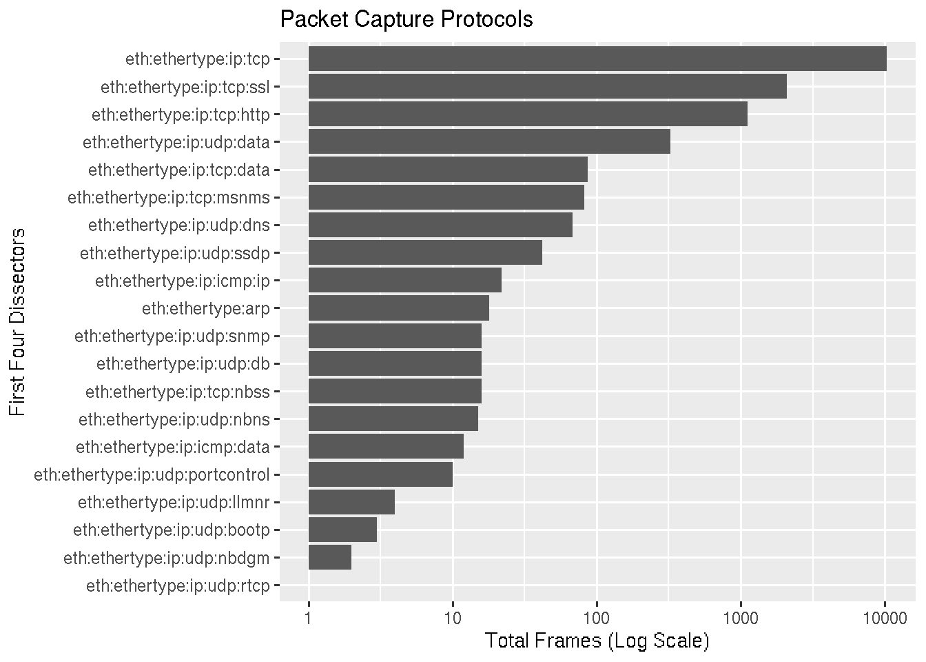
Protocols
In this graph we’re trying to emulate [Statistics -> Protocol Hierarchy]. The frame.protocols field lists the dissectors used in the frame separated by a colon. A regex is used to extract out the first four dissectors and create a new variable. This variable is grouped variable and count the number of frames for each one.
We graph the output slightly differently, first flipping the coordinates to that the x-axis runs top to bottom and y-axis runs left to right, then scaling the x-axis logarithmically.
No surprises that TCP traffic accounts for the most packets, followed by SSL (TLS) and HTTP.
pcap %>%
    mutate(
        first_4_proto = str_extract(frame.protocols, '(\\w+)(:\\w+){0,4}')
    ) %>%
    count(first_4_proto) %>%
    ggplot() +
    geom_col(aes(fct_reorder(first_4_proto, n), n)) +
    coord_flip() +
    scale_y_log10() +
    labs(
        title = 'Packet Capture Protocols',
        x = 'First Four Dissectors',
        y = 'Total Frames (Log Scale)'
    )
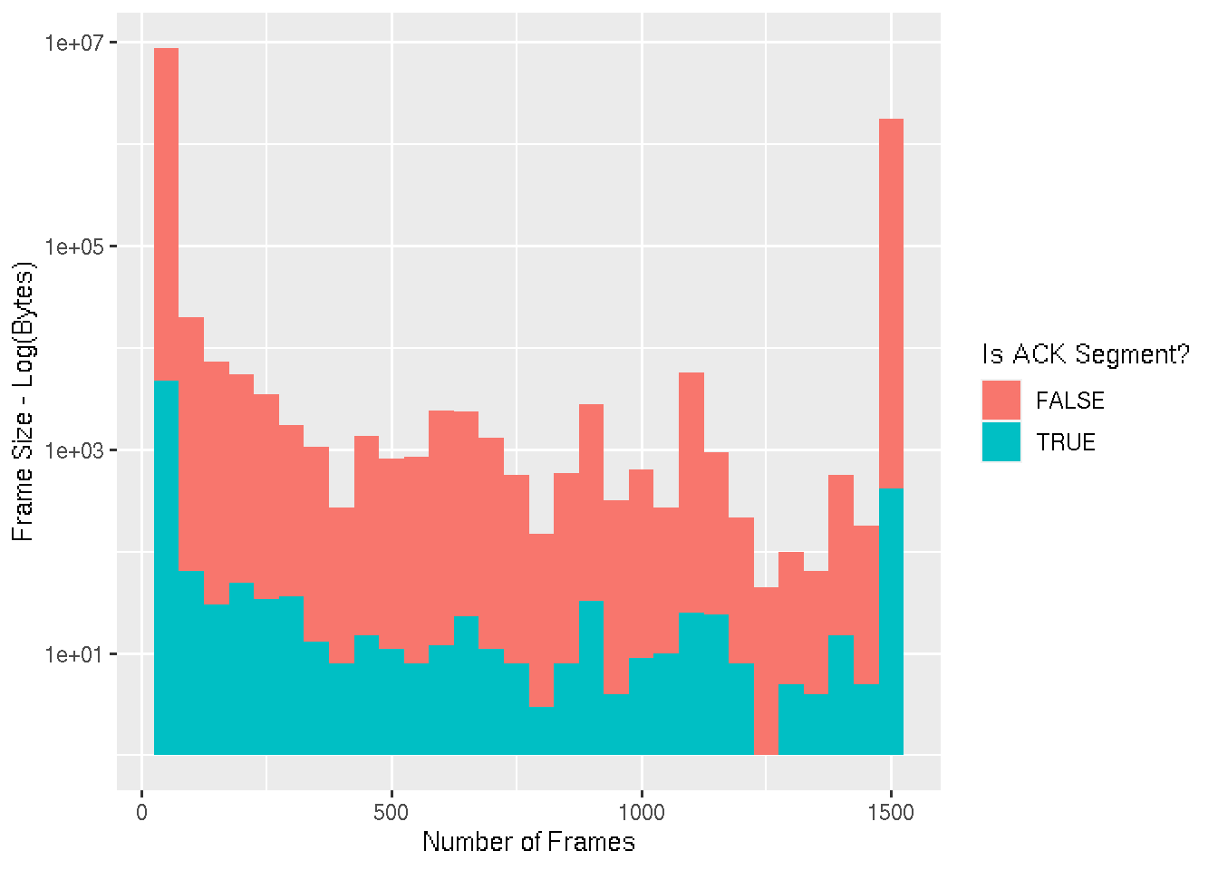
Packet Lengths
This graph is a visual representation of [Statistics -> Packet Lengths]. The axis is broken up into bins of 50 bytes, and the height of each bar represents the log of the number of packets seen with a size within that range. The bars are also colourised based on whether the packet is a TCP acknowledgement or not.
pcap %>%
    mutate(is_ack = !is.na(tcp.analysis.acks_frame)) %>%
    ggplot() +
    geom_histogram(aes(frame.len, fill = is_ack), binwidth = 50) +
    labs(
        x = 'Number of Frames',
        y = 'Frame Size - Log(Bytes)',
        fill = 'Is ACK Segment?'
    ) +
    scale_y_log10()
Exploratory
We’ve emulated (to an extent) some of the Wireshark statistical information, let’s dig a little deeper and see what else we can discover about this particular packet capture.
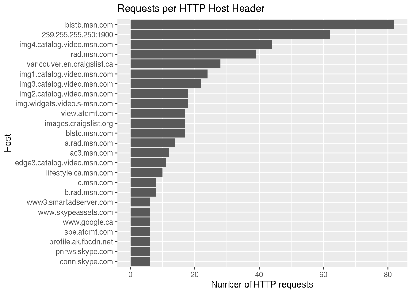
HTTP Hosts
Let’s explore what HTTP hosts requests are being made to. We filter out all packets without the http.host field, which contains the value of the Host header, and count the number of occurrences of each distinct value.
We see an MSN address topping the list, however interestingly a broadcast address is second.
    pcap %>%
    dplyr::filter(!is.na(http.host)) %>%
    count(http.host) %>%
    top_n(20, n) %>%
    ggplot() +
    geom_col(aes(fct_reorder(http.host, n), n)) +
    coord_flip() +
    labs(
        title = 'Requests per HTTP Host Header',
        x = 'Host',
        y = 'Number of HTTP requests'
    )
Let’s dive a little deeper on this - what are the protocols of these multicast HTTP packets?
pcap %>%
    dplyr::filter(http.host == '239.255.255.250:1900') %>%
    select(frame.protocols) %>%
    distinct()
## # A tibble: 2 x 1
##   frame.protocols
##   <chr>
## 1 eth:ethertype:ip:udp:ssdp
## 2 eth:ethertype:ip:icmp:ip:udp:ssdp
We see that it’s SSDP broadcasting out, as well as other hosts responding with ICMP messages. What are the ICMP messages?
pcap %>%
    dplyr::filter(
        frame.protocols == 'eth:ethertype:ip:icmp:ip:udp:ssdp'
    ) %>%
    select(icmp.type, icmp.code)
## # A tibble: 20 x 2
##    icmp.type icmp.code
##        <dbl>     <dbl>
##  1        11         0
##  2        11         0
##  3        11         0
##  4        11         0
##  5        11         0
##  6        11         0
##  7        11         0
##  8        11         0
##  9        11         0
## 10        11         0
## 11        11         0
## 12        11         0
## 13        11         0
## 14        11         0
## 15        11         0
## 16        11         0
## 17        11         0
## 18        11         0
## 19        11         0
## 20        11         0
Type 11 (time exceeded) code 0 (time to live exceeded in transit) messages.
TLS Versions and Ciphers
Taking more of a security perspective, let’s take a look at the SSL/TLS versions and ciphers being used.
During the TLS handshake, the ClientHello message has two versions: the record version which indicates which version of the ClientHello is being sent, and the handshake version which indicates the version of the protocol the client/server wishes to communicate on during the session. We’re concerned with the handshake version:
pcap %>%
    dplyr::filter(!is.na(ssl.handshake.version)) %>%
    count(ssl.handshake.version)
## # A tibble: 2 x 2
##   ssl.handshake.version     n
##   <chr>                 <int>
## 1 0x00000300               10
## 2 0x00000301              126
The predominant version is TLS 1.1 (0x0301), with some TLS 1.0 (0x0300).
What about the ciphers being used? By filtering out packets that aren’t part of the handshake and selecting the ciphersuite variable we can get an idea.
pcap %>%
    dplyr::filter(!is.na(ssl.handshake.ciphersuite)) %>%
    select(ssl.handshake.ciphersuite)
## # A tibble: 122 x 1
##    ssl.handshake.ciphersuite
##                        <dbl>
##  1                     49162
##  2                         5
##  3                     49162
##  4                     49162
##  5                     49162
##  6                     49162
##  7                     49162
##  8                     49162
##  9                         5
## 10                         5
## # … with 112 more rows
Unfortunately we don’t get the ciphersuite in a human readable format. Instead we get the the decimal version of the two-byte identification number. This makes it’s difficult to make a security judgement on these ciphers.
Let’s translate these into a human readable format. This website that has a translation table and also - thankfully - has a CSS element that we can use to pull out the values.
The rvest library is used to download the page, pull out the table entries, and convert them to text. Each entry is a string with the ciphersuite name and hex separated by spaces, so those are split, and finally the columns are given sensible names.
library(rvest)

s <- 'https://tinyurl.com/t74r83x'

s %>%
    xml2::read_html() %>%
    html_nodes('.memItemRight') %>%
    html_text() %>%
    str_split_fixed("\\s+", n = 2) %>%
    as_tibble(.name_repair = ~{ c('ciphersuite', 'hex_value') }) %>%
    mutate(hex_value = as.hexmode(hex_value)) ->
    cipher_mappings

head(cipher_mappings)
## # A tibble: 6 x 2
##   ciphersuite              hex_value
##   <chr>                    <hexmode>
## 1 TLS_NULL_WITH_NULL_NULL  0
## 2 TLS_RSA_WITH_NULL_MD5    1
## 3 TLS_RSA_WITH_NULL_SHA    2
## 4 TLS_RSA_WITH_RC4_128_MD5 4
## 5 TLS_RSA_WITH_RC4_128_SHA 5
## 6 TLS_RSA_WITH_DES_CBC_SHA 9
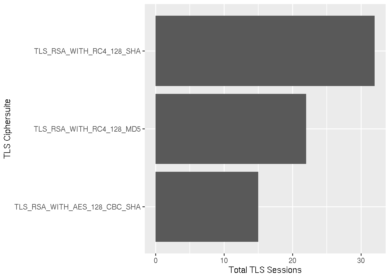
We’re only concerned with the ciphersuite the ServerHello responds with, because this is the one that is ultimately used. Thus other records are filtered out, the number of discrete ciphersuites is counted, and the values converted to hex.
A left join by the hex values is performed which adds the ciphersuite column to the data. The data is presented as a bar graph, the height of the bar representing the number of times each ciphersuite was used in an TLS connection.
pcap %>%
    dplyr::filter(ssl.handshake.type == 2) %>%
    count(ssl.handshake.ciphersuite) %>%
    mutate(
        cs = as.hexmode(ssl.handshake.ciphersuite)
    ) %>%
    left_join(
        cipher_mappings,
        by = c('cs' = 'hex_value')
    ) %>%
    ggplot() +
    geom_col(aes(ciphersuite, n)) +
    coord_flip() +
    labs(x = 'TLS Ciphersuite', y = 'Total TLS Sessions')
DNS Response Times
Finally, let’s take a look at DNS response times. We filter for DNS responses, group by the query and the response type, calculate the mean response time for each of these groups an plot it.
pcap %>%
    dplyr::filter(dns.flags.response == 1) %>%
    group_by(dns.qry.name, dns.resp.type) %>%
    summarise(mean_resp = mean(dns.time)) %>%
    ggplot() +
    geom_col(aes(
        fct_reorder(dns.qry.name, mean_resp),
        mean_resp,
        fill = as.factor(dns.resp.type)
    )) +
    coord_flip() +
    labs(
        x = 'DNS Query Name',
        y = 'Mean Response Time (seconds)',
        fill = 'DNS Response Type'
    )
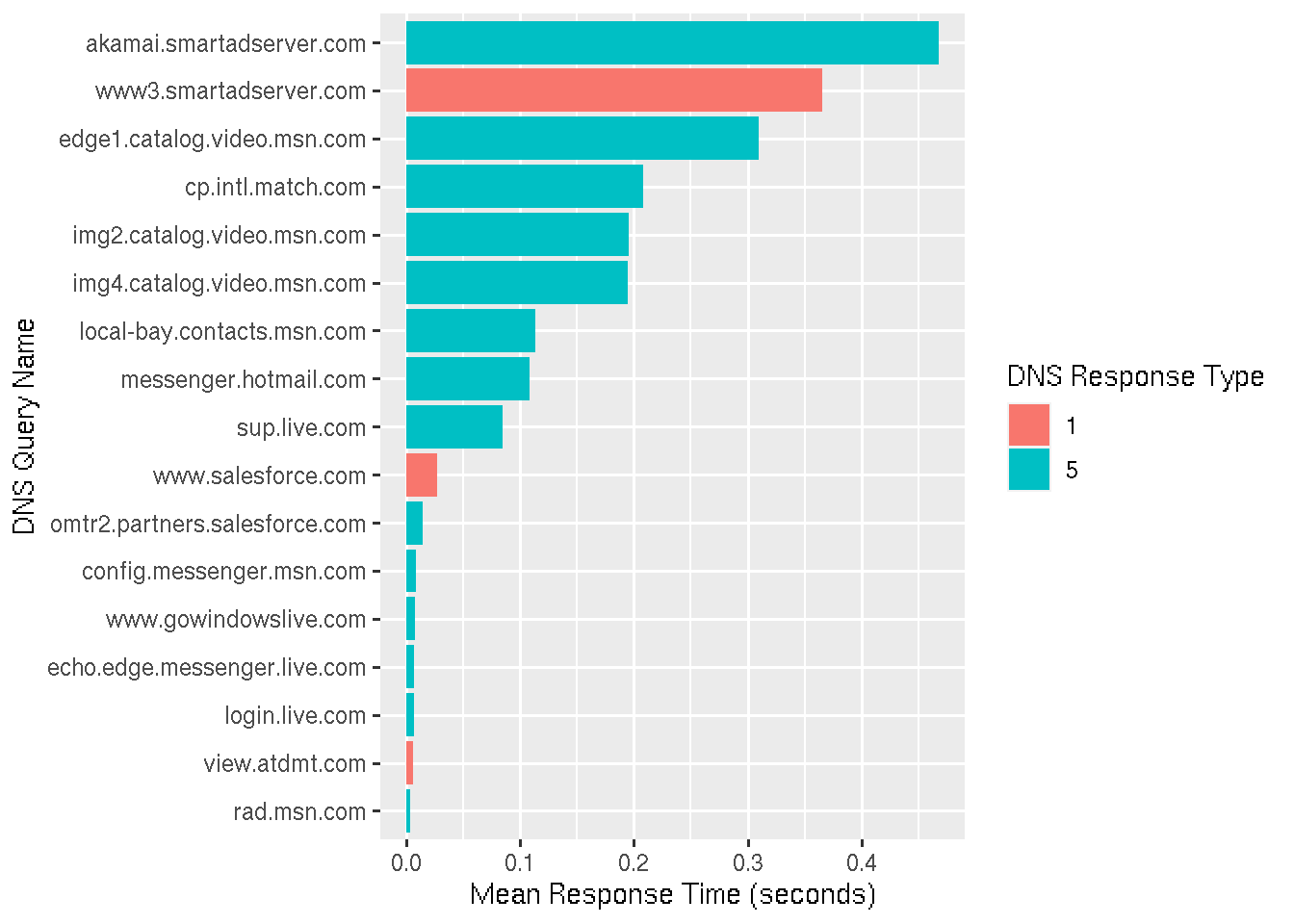
What we see that response time for some domains differs. The shorter response times have a low variance, indicating they likely came from the resolver’s cache. Other responses have a higher variance, either because of network latency to authoritative DNS servers, or because other DNS resolvers in the chain (opaque to us) have the entry cached as well.
Summary
In this article I’ve discussed the conversion of packet capture files to CSV, and exploratory data analysis of these packet captures. I hope I’ve shown a how standard packet capture analysis with Wireshark can be complimented by analysis with the R language.