A Noisy Wind Tunnel
I raced bikes as a junior and came back to it after a twenty year hiatus. One of the biggest contrasts I’ve seen in the sport is the proliferation of bike sensors. All I used to have ‘back in the day’ was a simple computer with velocity and cadence. Now I’ve got that, plus position via GPS, power, heart rate, pedal smoothness and balance, all collected and displayed on my phone.
It’s all well and good to collect and visualise this data, but surely there was more I could do with it? After much thought, I realised I could use it determine the aerodynamic efficiency of different positions on the bike. So in this article I’m going to attempt to answer the following question:
How much more aerodynamically efficient is it to ride with your hands on the drops of the handlebars, rather than the tops?
There are two main sections of the article: in the first section we look at how the data was generated, loaded into R, and transformed into a state that’s ready for analysis. It’s in this section where we see R really shine, with a simple and element method of transforming XML into a rectangular, tidy data format.
In the second section we define an aerodynamic model (or more accurately reuse a common model), then perform a simple regression of this data to determine the aerodynamic properties. Diagnostics on the highlight a key missing element, forcing us to update the model to get better estimates of the aerodynamic properties.
Data Acquisition
We’ll first look at how the experiment was set up and how the data was captured. A track bike (with has a single, fixed gear) was ridden around the Coburg velodrome which is a 250m outdoor track. A sensor (Wahoo speed) on the hub of the wheel collected the velocity, and the pedals (PowerTap P1s) collected power and cadence.
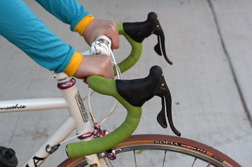
Data was gathered while in two different positions on the bike1. The first position which we will call being on the ‘tops’ looked similar to this (sans brake levers):
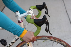
The second position which we will call being on the ‘drops’ looked like this:
For each position the pace was slowly increasing from 10km/h to to 45km/h in approximately 10km/h increments. For each increment level, the pace was held as close as possible to constant for two laps, increasing to three laps for higher velocities to try and get enough samples.
The experimental environemnt is far from clean, with two main external elements affecting our data generation process: wind, and the lumpyness of the velodrome. Because we are moving around and oval, both of these external elements will add noise to the data, but shouldn’t bias it in any one direction. If there was any biasing effect it would be from wind gusts.
What results are we expecting? We’re expecting better aerodynamics when in the drops position due to two factors: a reduction in the front on surface area, and a more streamlined shape.
Transforming the Data
The data is downloaded in TCX (Training Center XML) format. While good for us that it’s in a standard structured format, it’s not quite in the rectangular, tidy data that we need for our analysis. The first step is therefore to extract and transform it. The XML is is made up of a a single activity with multiple laps. Each lap has trackpoints which contain a timestamp and the data collected (velocity, power, heartrate, etc). A trackpoint is taken every one second.
You can look at the full file here, but below is a high level overview of the structure:
<TrainingCenterDatabase>
    <Activities>
        <Activity>
            <Lap>
                <Track>
                    <Trackpoint>
                        <Time>2022-01-16T00:00:41Z</Time>
                        <DistanceMeters>1.48</DistanceMeters>
                        <HeartRateBpm>
                            <Value>105</Value>
                        </HearthRateBpm>
                        <Cadence>32</Cadence>
                        <Extensions>
                            <TPX>
                                <Speed>3.19</Speed>
                                <Watts>56</Watts>
                            </TPX>
                        </Extensions>
                    </Trackpoint>
                    <!-- Multiple trackpoints (1 second per sample) -->
                </Track>
            </Lap>
            <!-- Multiple laps (generated manually) -->
        </Activity>
    </Activities>
</TrainingCenterDatabase>
Thanks to the XML2 library, XPath queries, the vectorised nature of R, extracting and transforming this data is relatively easy:
cycle_data <-
    read_xml('cycle_data.tcx') %>%
    xml_ns_strip() %>%
    xml_find_all('.//Trackpoint[Extensions]') %>%
    {
        tibble(
            time = xml_find_first(., './Time') %>% xml_text() %>% ymd_hms(),
            velocity = xml_find_first(., './Extensions/TPX/Speed') %>% xml_double(),
            power = xml_find_first(., './Extensions/TPX/Watts') %>% xml_integer(),
            bpm = xml_find_first(., './HeartRateBpm/Value') %>% xml_integer(),
            cadence = xml_find_first(., './Cadence') %>% xml_integer(),
            lap = xml_find_num(
                .,
                'count(./parent::Track/parent::Lap/preceding-sibling::Lap)'
            ),
        )
    }
| time | velocity | power | bpm | cadence | lap |
|---|---|---|---|---|---|
| 2022-01-16 00:00:42 | 3.19 | 56 | 105 | 32 | 0 |
| 2022-01-16 00:00:43 | 3.28 | 100 | 104 | 34 | 0 |
| 2022-01-16 00:00:44 | 3.50 | 75 | 104 | 36 | 0 |
| 2022-01-16 00:00:45 | 3.58 | 84 | 105 | 38 | 0 |
| 2022-01-16 00:00:46 | 3.78 | 79 | 106 | 40 | 0 |
| 2022-01-16 00:00:47 | 4.08 | 83 | 107 | 43 | 0 |
| 2022-01-16 00:00:48 | 4.39 | 172 | 108 | 46 | 0 |
| 2022-01-16 00:00:49 | 4.58 | 197 | 109 | 47 | 0 |
| 2022-01-16 00:00:50 | 4.78 | 213 | 111 | 49 | 0 |
| 2022-01-16 00:00:51 | 5.00 | 288 | 113 | 51 | 0 |
While terseness is elegant it can also make the code difficult to interpret, so I think it’s valuable to go through each step of the pipeline:
- The TCX file is read in as as an xml_document
- The XML is namespaced, but as we’re only working with this file we strip the namespace to make our XPath easier to work with.
- Using the
.//Trackpoint[Extensions]XPath we find all ‘trackpoint’ nodes that have a child ‘extensions’ node.- We do this because some of the trackpoints only have a timestamp with no data.
- We then construct a data frame (a tibble) by finding and extracting the velocity, power, etc from each trachpoint, with the XPaths being relative to the trackpoint node.
- The braces to stop the normal behaviour of the left-hand side of the pipe being passed as the first argument to the tibble.
- Determining which ‘lap’ a trackpoint belongs to takes a little more work. We do this by finding it’s grandparent lap node and counting how many preceding lap siblings it has. The first lap will have 0 siblings, the second lap 1, and so on.
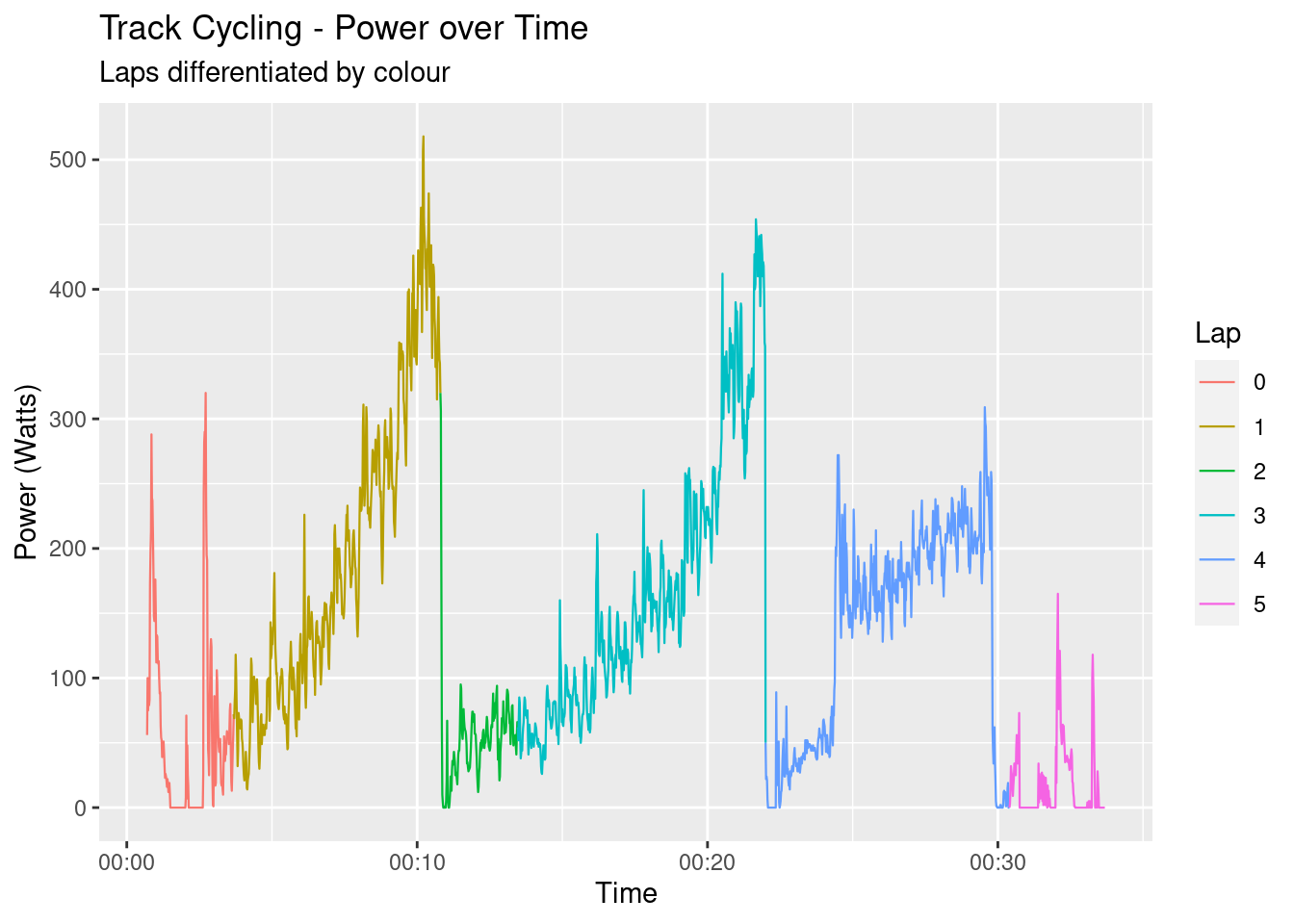
That’s it! With less than 20 lines of R the XML has been transformed into a tidy, rectangular data format, ready for visualisation and analysis. Speaking of visualisation, let’s take a look at a few different aspects of the data to get a general feel for it. The following graph shows the power output over time, each lap being coloured separately. Laps one and three contain the data that will be used in the model.
The data was generated on a track bike which has only a single gear, so the velocity and cadence should have a near perfect linear relationship:
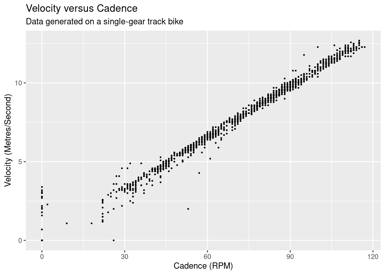
There’s a clear linear relationship, but there is also distribution of velocities across each cadence value. This is likely due to the difference in precision between the cadence and the velocity, as cadence is measured as a integer whereas velocity is a double with a single decimal point2.
Before we look at the power and velocity, we need to do a little bit of housework. The second and fourth laps that contain our experimental data are extracted, and a new position factor variable is created with appropriately named levels.
In what could be considered controversial, we’re going to remove data points where the bike was accelerating - i.e. the rate of change of the power between trackpoint samples was between -10 and 10 watts. Acceleration was required to ‘move’ to different velocity increments, but our model only relates to points of (relatively) constant velocity. Given our knowledge of the data generation process, I think this data removal can be justified.
cycle_data_cleaned <-
    cycle_data %>%
    filter(
        lap %in% c(1,3),
        between(power - lag(power), -10, 10)
    ) %>%
    mutate(position = fct_recode(as_factor(lap), "Tops" = "1", "Drops" = "3"))
We can now view the power output versus the velocity by position of the data we’ll be using in our model.
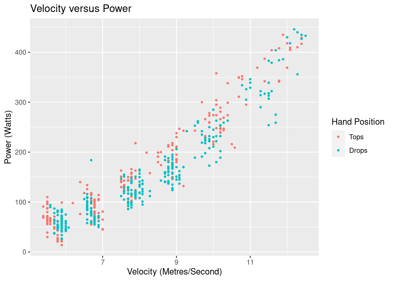
We see an exponential relationship, and can see the “blobs” of data where I have tried to keep a constant velocity. What is not instantly visible is the difference in power output versus velocity for each of the different hand positions.
Defining and Building a Model
We’ll be using the the classic drag equation as our model:
$$ F_d = \frac{1}{2}\rho C_D A v^2$$ This says that the force of drag \(F_d\) on the bike/body system when moving through the air is proportional to half of the density of the fluid (\(\rho\)) times the drag coefficient the bike/body (\(C_D\)) times the front on cross-sectional area (\(A\)) times the square of the velocity (\(v\)). I’m going to bundle up all coefficients into a single coefficient \(\beta\).
$$ \text{Let } \beta = \frac{1}{2} \rho C_D A $$ $$ F_d = \beta v^2 $$ We’ve got force on our left-hand side, but we need power. Energy is force times distance, and power is energy over time, so we have:
$$ F_d \Big( \frac{x}{t} \Big) = \beta v^2 \Big( \frac{x}{t} \Big)$$ Distance over time is velocity so we are left with:
$$ P_d = \beta v^3 $$ The coefficient is conditional on the position variable, so we’ll end up with two coefficients from this model:
$$ P_d = \Bigg\{\begin{array}{ll}
\beta_{tops} v^3 & \text{if}\ position = tops \\
\beta_{drops} v^3 & \text{if}\ position = drops
\end{array} $$
Is this a perfect model? Not at all, but for our purposes it should be reasonable. Don’t make me tap the “all models are wrong…” sign!
The model will give us an estimate (with some uncertainty) \(\beta_{tops}\) value when I was on the tops of the handlebars, and a \(\beta_{drops}\) value when I was in the drops.
We have some prior information that we can be included in the model: it takes zero watts to go zero metres per second. This implies that our model should go through the origin \((0,0)\) and we should not include an intercept. I believe that given our strong knowledge of the process that generated the data, removing the intercept is valid.
cycle_data_mdl <-
    cycle_data_cleaned %>%
    lm(power ~ 0 + position:I(velocity^3), data = .)
Here’s what model looks like overlayed on the data:
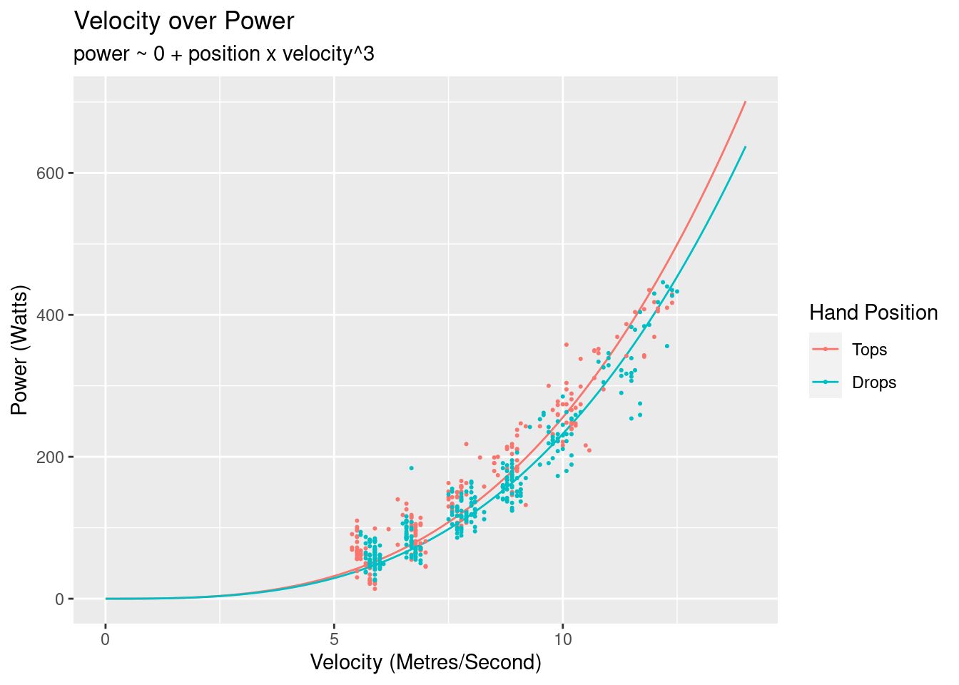
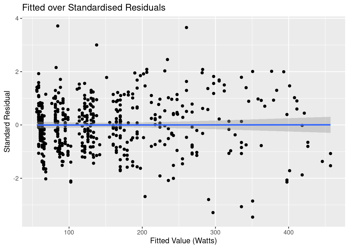
As expected the drops is more efficient that the tops. Before looking at the parameters of the model let’s first look at some diagnostics. The first one to look at is the fitted values of the over the residuals:
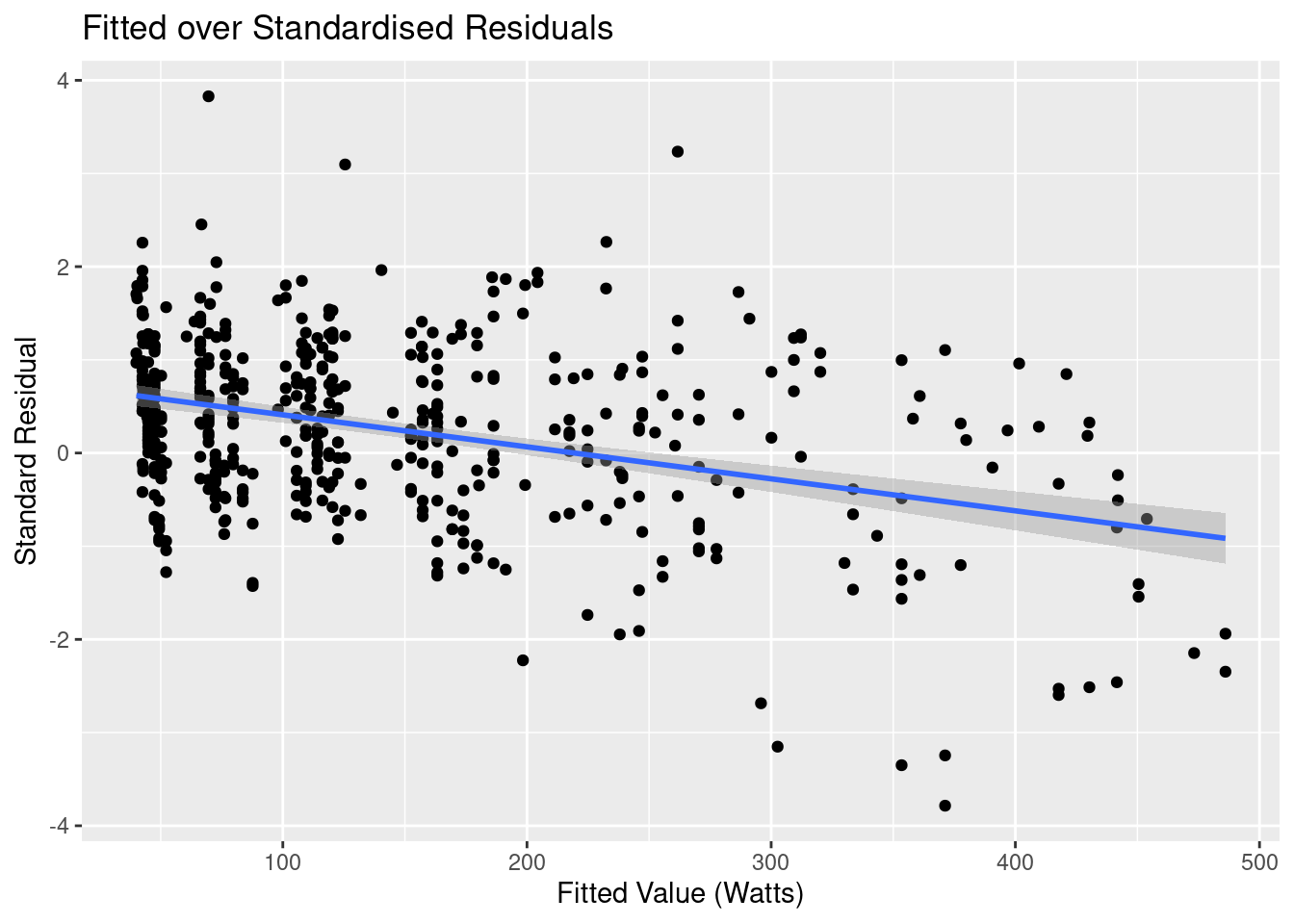
I’ve added a linear regression line to highlight the trend, and it shows shows something quite interesting: there appears to be a linear relationship that our model hasn’t accounted for.
If we think back to our model, we were only accounting for the power required to overcome drag, but there’s another force in play that we’ve completely ignored: friction. There’s the rolling friction of the wheels on the tack, and the sliding friction of the hubs, the chainset and pedals, and of the chain on the sprocket.
With this realisation, let’s try and build a better model to account for this force.
Building a Better Model
In the original model, \(P_{Total} = P_{Drag}\), but in our updated model total power used is made up of power to overcome drag plus power to overcome friction:
$$ P_{t} = P_{d} + P_{f} $$ Once again knowing that forc times distance is energy, and energy over time is power, we end up with:
$$ P_{f} = \frac{ F_{f} \times x }{ t } = F_{f}v $$
If we let \(\beta_1 = F_{f}\) then our updated model is:
$$ P_d = \beta_1 v + \Bigg\{\begin{array}{ll}
\beta_{tops} v^3 & \text{if}\ position = tops \\
\beta_{drops} v^3 & \text{if}\ position = drops
\end{array} $$
We now run our updated model over the data. The frictional component is not going to be affected by the position on the handlebars, so we ensure it’s not conditional on the position:
cycle_data_mdl <-
    cycle_data_cleaned %>%
    lm(power ~ 0 + velocity+ position:I(velocity^3), data = .)
Here’s the updated on model on top of the original data:
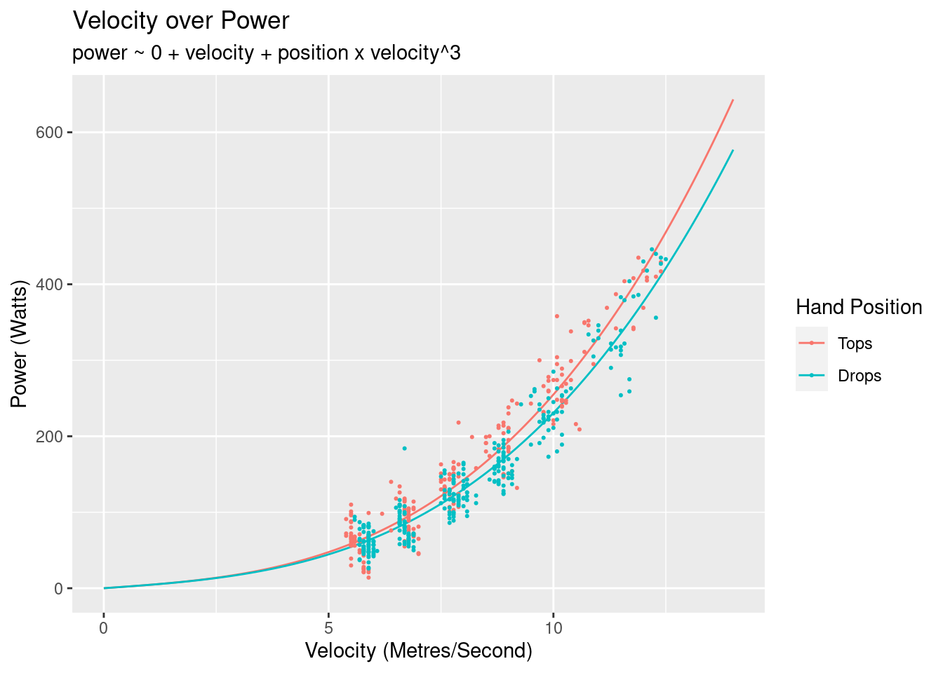
Hard to discern if much difference from this graph, so we return to the fitted versus residual diagnostic graph:
That’s looking much better! We’ve now captured the linear component, the residuals are random, and the variation is reasonably even across the entire spread of fitted values. There are a few outliers, and a more rigourous analysis would look to determine whether they had significant leverage on our regression line. Subjectively looking at this graph though my guess would be no.
The other type of diagnostic to look at is a histogram of the residuals. A linear regression has an assumption that the residuals are normal. The residual shape doesn’t affect the point estimates of the model, but does affect the confidence intervals of the parameters.
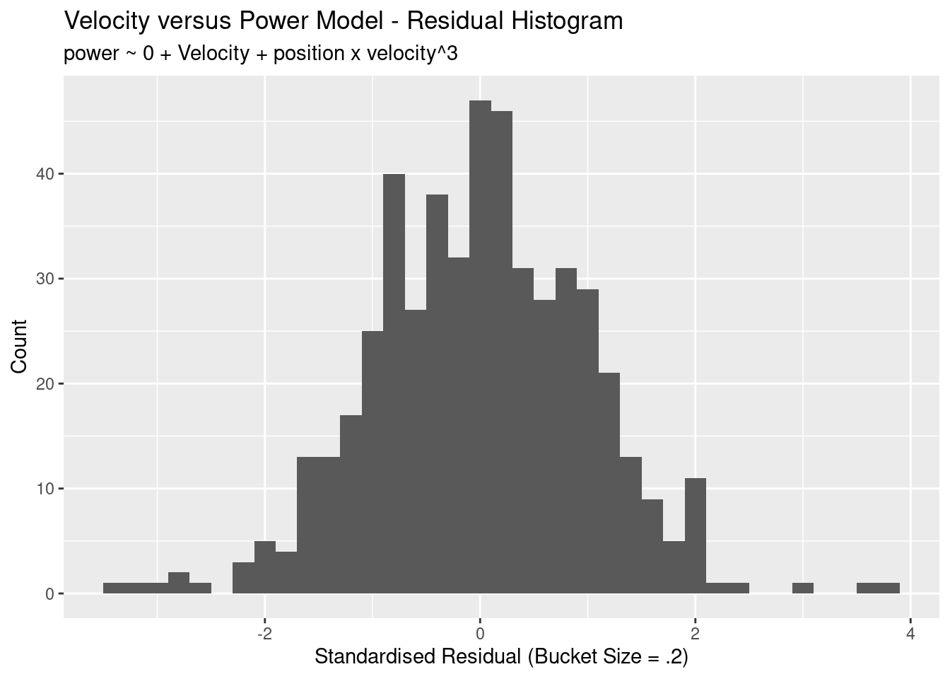
This looks great: the residuals are approximately normal, there’s not much mass at outside of 2 standard deviations, and the mean sits approximately at zero.
With confidence in the model we now take a look at the parameters:
| Term | Estimate | Std Error | Statistic | P Value |
|---|---|---|---|---|
| velocity | 4.1788613 | 0.3782129 | 11.04897 | 0 |
| positionTops:I(velocity^3) | 0.2131439 | 0.0045782 | 46.55634 | 0 |
| positionDrops:I(velocity^3) | 0.1889915 | 0.0044721 | 42.26044 | 0 |
The velocity term is the \(\beta_1\) coefficient, which is the the frictional force of the bike. The model has determined that the frictional of the bike accounts for 4.18 Newtons of force.
The next two values the \(\beta_{tops}\) and \(\beta_{drops}\) coefficients. We’re not concerned with the specific values (being a combination of the fluid density, drag coefficient, and my cross-sectional area), but what we want to look at is percentage change between these values. The result is that we need to use 11.33% less power to acheive the same velocity in the two different positions. Put another way, we are 11.33% more efficient when positioned in the drops rather than on the tops.
The following table gives you an idea on the differences in power required for velocities of 20, 40, and 60 km/h.
| Velocity | Tops | Drops | Power Difference |
|---|---|---|---|
| 20 | 59.76 | 55.62 | 4.14 |
| 40 | 338.81 | 305.68 | 33.13 |
| 60 | 1056.43 | 944.61 | 111.82 |
Don’t Forget the Uncertainty
In calculating the average percent decrease, the uncertainty in the parameters has been thrown away. If we assume two things about the parameters:
- The parameter estimates are normally distributed, and
- There is no covariance between the parameters
then we can take a computational approach to determining the uncertainly of the percentage. Drawing samples from each of the parameter distributions (with a mean of the parameter estimate and a standard deviation of the standard error), we can calculate the percentage for each pair of samples3, giving us a distribution of percentages. The quantiles we want to determine can then be calculated from this data.
# Extract the parameter and standard error from the model.
beta_tops <- tidy(cycle_data_mdl)[[2]][2]
sigma_tops <- tidy(cycle_data_mdl)[[3]][2]
beta_drops <- tidy(cycle_data_mdl)[[2]][3]
sigma_drops <- tidy(cycle_data_mdl)[[3]][3]

# Generate our samples and calculate the percentages
percent_distribution <-
    tibble(
        beta_top_dist = rnorm(1000000, beta_tops, sigma_tops),
        beta_drop_dist = rnorm(1000000, beta_drops, sigma_drops),
        percent = ((beta_top_dist - beta_drop_dist) / beta_top_dist) * 100
    )
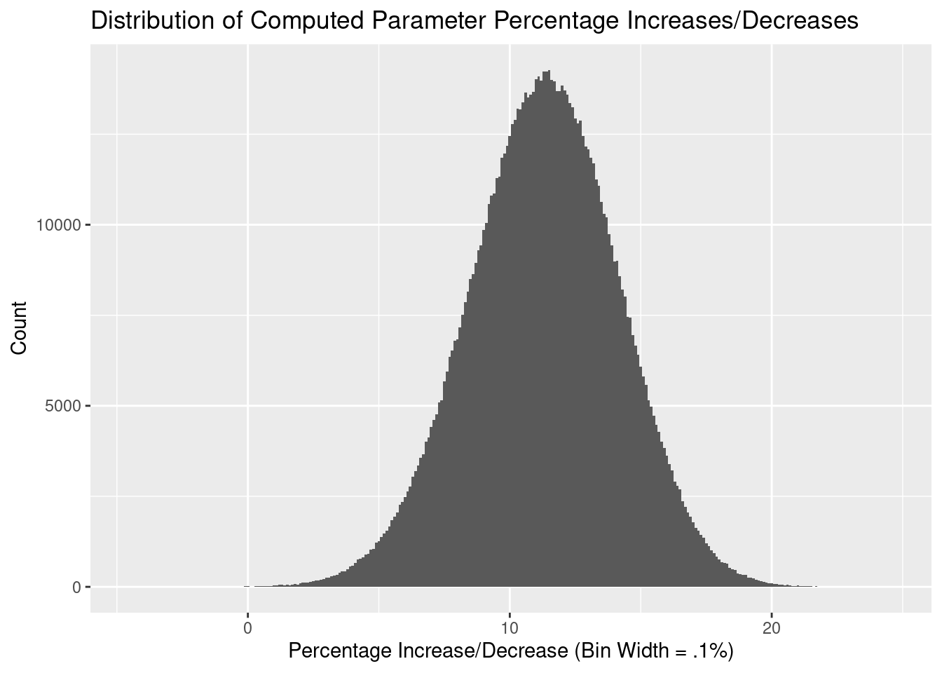
Our 89%4 confidence interval is therefore [6.69%, 15.77%].
Summary
In this article we looked at the aerodynamics of different positions on a bike. We gathered data using different sensors, and showed the elegance of R by transforming XML data into a rectangular, tidy data frame.
We defined a simple model and used this to perform a regression of power required to maintain a specific velocity. By performing diagnostics on this model, we were able to identify that our model was incomplete, and that we were likely not including friction in the model. We defined and created a new model with friction included, which performed better than our original model.
The ultimate aim of the article was to determine how much more efficient it is to ride in the ‘drops’ of the handlebars rather than the ‘tops’. From our modelling we found the average estimate of our efficiency gain to be 11.33%, with an 89% confidence interval of [6.69%, 15.77%].
Images courtesy of bikegremlin.com ↩︎
A linear regression of cadence on velocity was performed and the residuals were in the range of (-.5, .5). This supports our precision difference hypothesis. ↩︎
Thanks to /u/eatthepieguy for responding to my query on this. ↩︎
Why 89%? Well, why 95%? ↩︎