Bandwidth Seasonal Decomposition
Over the past few months I’ve been studying time series data and modelling using Rob Hyndman’s fantastic Forecasting: Principles and Practice textbook. My area of expertise is in networking, and a significant amount of operational the data that we deal with fits into the category of time series data. It could be throughput through a router, sessions on a firewall, or the counts of HTTP response codes from a content delivery network.
In this article we’re going to look at applying time series concepts and models to the bandwidth utilisation - both ingress and egress - of a network router. Using historical data, we’ll see how we can decompose this data into separate components, and then use these components to forecast the bandwidth utilisation in the future.
Caveats
A couple of things to note before we start. In a real world situation we’d likely try a few different models, tune them with different parameters, and evaluate them using cross validation or bootstrapping. We’re going to keep things simple in this article by using a single, parsimonious model with one set of parameters to forecast our network throughput, and a simple training/test set split for validating our model’s performance.
We’re also going to skip over the underlying mathematics of our methods, focusing on their practical use. Leaving this out is a hard decision for me, as I dislike using statistical methods without a decent understanding of how things are working under the hood. However this is an article, not a dissertation, so the underlying mathematics will be left for another day.
A Quick Primer
Time series data focuses on a single variable that is observed multiple times over a period of time. Contrast this against cross-sectional data, which focuses on multiple variables observed at the same point in time.
Certail kinds of time series data exhibit patterns which make it possible to split or ‘decompose’ it into different components:
- Trend: the long term increase or decrease in the data.
- Cycle: these are rises and falls in the data that are not a fixed period.
- Seasonal: a pattern that occurs due to seasonal factors such as the time of the day. It’s a fixed and known period.
- Remainder: what’s left after the trend, cycle, and seasonal components are removed.
Often the trend and cycle components are combined into a single component called the trend-cycle.
The Data
Let’s get an understanding of the data and perform some diagnostics on it. The data we’re using is contained in a time series table or tsibble called throughput. It consists of 1440 observations of the ingress and egress throughput through a router over 30 days. Each observation is the average throughput through the router over a 30 minute interval.
As we’re going to be forecasting, we immediately split out data into a training set and a test set. The training set will contain the first 23 days of data, and the test set will contain the last 7. We’ll perform discovery and train our model on the training set, leaving the test set to ascertain the accuracy of our model.
# Training set
throughput_train <-
    throughput %>%
    filter_index(. ~ '2021-06-24')

# Test set
throughput_test <-
    throughput %>%
    filter_index('2021-06-25' ~ '2021-07-01')
Let’s take a look at the training data.
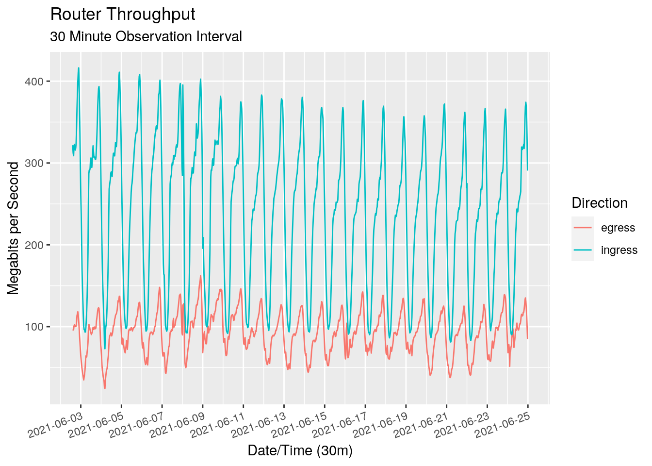
We see a very clear pattern with a daily “seasonal period” for both the ingress and egress directions. As expected, there is more ingress data than egress data. We can use a seasonal plot to get a better view of the seasonality. This chart plots each day over the top of each other, giving us a view of the traffic profile throughout each hour of the day.
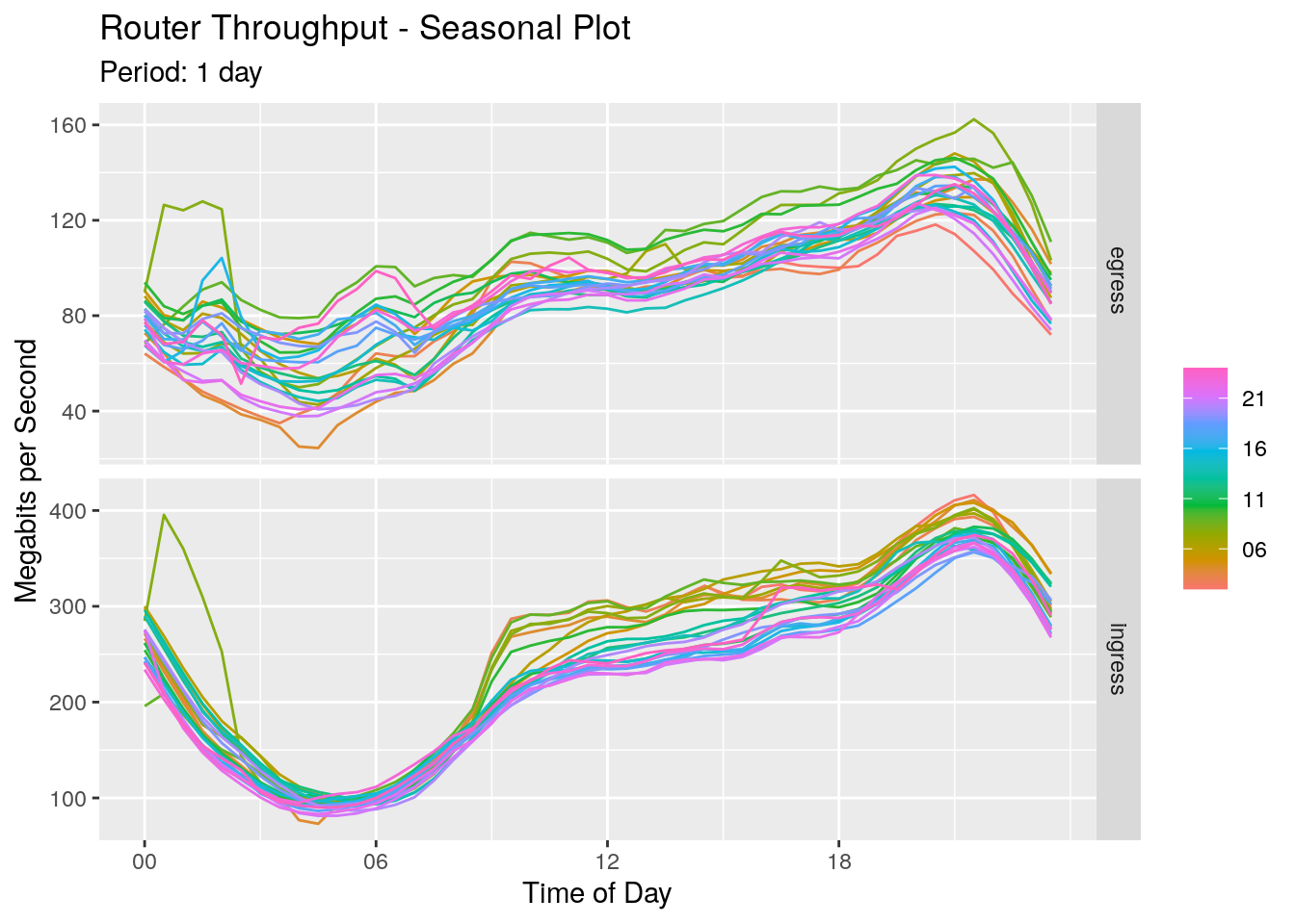
For both ingress and egress directions we see throughput dropping overnight and reaching a minimum around 4 am in the morning. It rises slowly at first, increasing at 9am when everyone starts work. It continues to rise throughput the day, peaking at around 9pm at night.
Modelling & Decomposition
We’re going to use ‘Seasonal and Trend decomposition using LOESS’ (STL) to decompose our time series, where LOESS is ‘LOcally Estimated Scatter point Smoothing’ (acronym inception!). We’ll use this to additively decompose our time series at time t into trend, seasonal, and remainder components, written as:
$$ y_t = T_t + S_t + R_t $$
Given our domain expertise and our initial view of the data, we’re confident that the seasonal period is one day. But it would be nice to put a quantitative number around that. We can use the feat_stl() function to pull out some STL specific features. As our data is measured every 30 minutes, a period of 48 is one day.
throughput_train %>%
    features(Mbps, list(~{ feat_stl(.x, .period = 48) })) %>%
    select(
        direction, trend_strength, starts_with('seasonal_strength')
    )
# A tibble: 2 × 3
  direction trend_strength seasonal_strength_48
  <chr>              <dbl>                <dbl>
1 egress             0.659                0.934
2 ingress            0.583                0.980
Both the trend strength and seasonal strength are statistics between 0 and 1, giving a measure of the strength of the components that the STL decomposition has extracted. We see a reasonable trend, but a very large seasonal strength, adding to the evidence of a daily seasonal pattern. We can now define our STL model, run it over our data, and extract out the components.
# Define out STL model
STL_tp <- STL(
    Mbps ~ trend() + season(period = '1 day'),
    robust = TRUE
)

# Run an STL model across out data
tp_stl_mdl <-
    throughput_train %>%
    model(STL = STL_tp)

# Extract out the components
tp_stl_decomp <- tp_stl_mdl %>% components()
Let’s take a look at each of the components in both the ingress and egress directions.
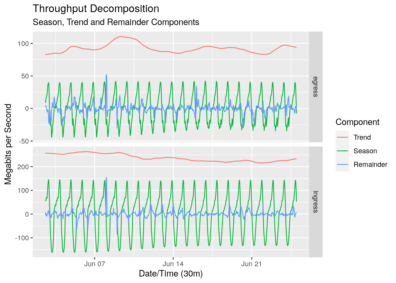
At a first glance the STL decomposition has done well. The trend-cycle looks pretty flat, which is to be expected given the relatively short time frame of the data. The ebbs and flows of the trend-cycle could be cyclic, or could be some longer term seasonality such as a weekly seasonality that we haven’t captured.
You may have noticed that there are negative values for both the seasonal and remainder component. As we’re using an additive model, these values are relative to the trend component at each point in point in time.
The decomposition also gives us the seasonally adjusted series. This is the series with the seasonal component removed.
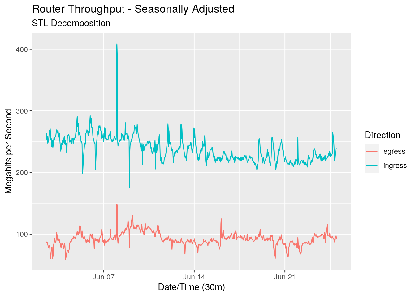
The seasonally adjusted series is important when we want to use this decomposition to forecast future values.
The remainder is relatively small, which is a good sign as it implies that we’ve pulled out most of the ‘signal’ in the trend-cycle and seasonal components. Let’s focus in on the remainder, also known as the residual.
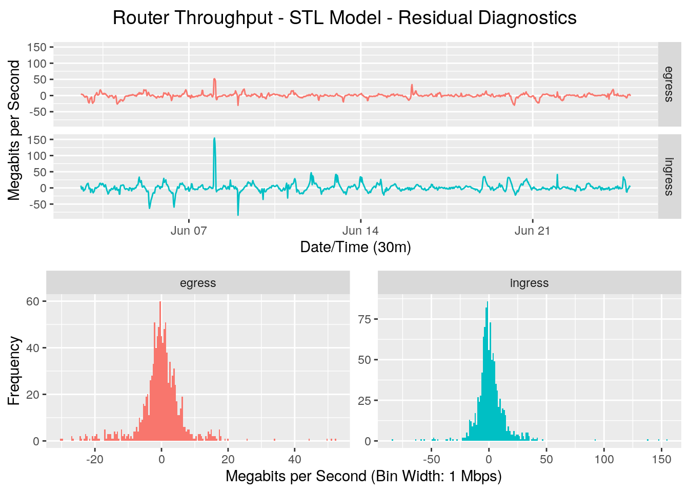
Looking at the line graph of the residuals, there may be some seasonality we haven’t completely captured, but that’s not surprising given the simplicity of the model. The residuals have a reasonably Gaussian distribution, but have long tails. A Quantile-Quantile plot will helps us view this in more detail.
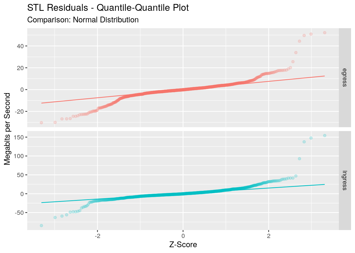
This plot compares the distribution of our residuals against a Gaussian distribution. If our residuals were Gaussian, all points would lie on the 45 degree line. We see that for one standard deviation around the mean fo egress direction, and two standard deviations for the ingress direction, our residuals are reasonably Gaussian. However outside of this we start to see the long tails of our data.
The distribution of the residuals doesn’t affect our forecasts, but it does affect our prediction intervals around the forecasts which assume a Gaussian distribution of the residuals. From what we’ve seen here we could be comfortable in around a 70% to 80% confidence interval around our forecasts, but anything higher breaks our assumptions and thus could not be relied upon.
Forecasting
Now that we’ve decomposed out series, we can use this as a way to forecast our series into the future. This is done by forecasting the seasonal component and and the seasonally adjusted components separately. These two separate forecasts can then be added together to form our single forecast. The prediction intervals are ‘reseasonalised’ in a similar way by adding the seasonal forecasts to the upper and lower limits of the prediction intervals.
We’re going to use two very simple models to forecast the components. To forecast the seasonally adjusted data we’ll use a naive method, which sets all forecasts to be the value of the last observation. To forecast the seasonal component, we’ll use a seasonal naive method, which sets the forecast to be equal to the last observed value from the same season, in our case a season being one day.
The decomposition_model() function from the fabletools package does a lot of the heavy lifting for us, and we then forecast our throughput for the next week:
# Decompose and model and forecast
throughput_dcmp_fc <-
    throughput_train %>%
    model(
        SNAIVE = decomposition_model(
            STL_tp,
            NAIVE(season_adjust),
            SNAIVE(`season_1 day` ~ lag('1 day'))
        ),
    ) %>%
    forecast(h = '7 days')
Let’s take a look at the forecast with a 70% prediction interval, and compare it to our test data which holds the real values for the next week.
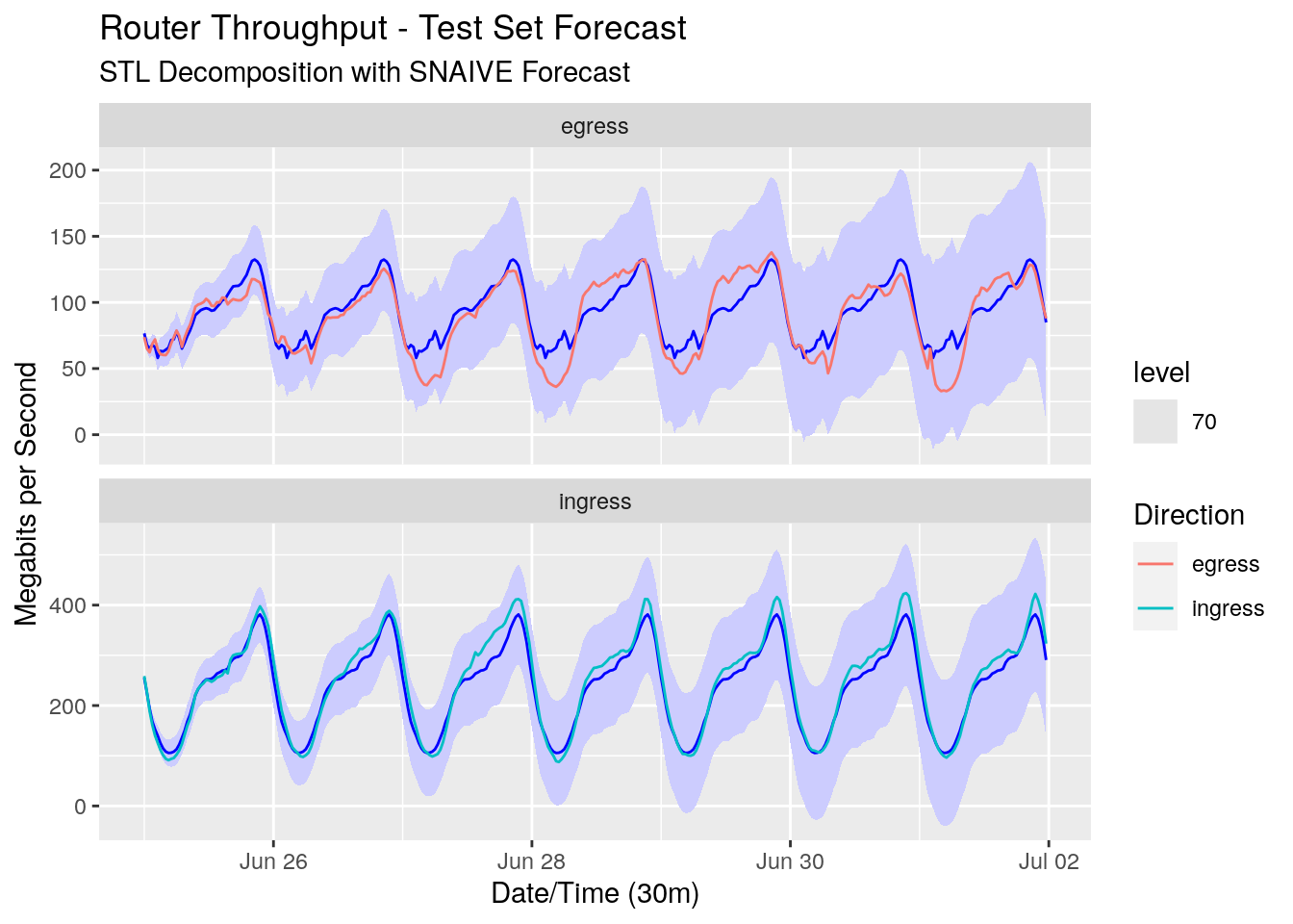
Using two of the most simple modelling methods, we’ve been able to forecast the throughput reasonably well. The forecasts for our egress direction are a little off due to the larger variance of the data, but the ingress direction forecasts are quite close to our test data. It’s also comforting that all of the test data sits comfortably within our 70% prediction interval.
We’ll use two metrics to gauge the accuracy of our forecasts. The first one is mean absoute error (MAE), which is the mean of the absolute value of the difference between our forecasts and the actual data. MAE is nice because it’s in the same units as our y-axis. The second is mean absolute percentage error (MAPE), which gives our error as a percentage of the actual test data. I should note that MAPE doesn’t work in all circumstances; for example it’s undefined if any of our test values are 0.
throughput_dcmp_fc %>%
    accuracy(
        throughput_test,
        measures = list(
            MAE = MAE,
            MAPE = MAPE
        )
    )
# A tibble: 2 × 5
  .model direction .type   MAE  MAPE
  <chr>  <chr>     <chr> <dbl> <dbl>
1 SNAIVE egress    Test   9.95 14.8
2 SNAIVE ingress   Test  16.0   6.50
For our egress direction our forecasts are out on average by 9.95 megabits per second, or 14.83 percent. With the reduced variability of the data our ingress forecasts are better. We’re only out on average by 16.04 megabits per second, or 6.5 percent.
Summary
In this article we’ve looked at analysing and forecasting network throughput. We analysed the data to confirm our assumptions about its seasonality, then used STL to decompose it into its seasonal, trend-cycle, and remainder components. We applied very simple modelling methods on each of these components and used these to forecast the next week of values. Comparing these values to the actual test data we found we were reasonably accurate with our forecasts, even with the simple methods used.
In a real world situation we’re probably not concerned with what our throughput utilising is next week. We’d be more interested about what the throughput will be in one or two years so we can make better decisions on investment. This doesn’t mean the simple models we’ve shown here aren’t useful, just that our training data would likely need to be larger to detect long term trend and cycle components and changes in daily seasonality. We may also want to try out some more complex models, test out their accuracy using cross-validation on our training data, and use bootstrapping to better determine the prediction intervals of the forecasts. But I’d hasten to add that more complex models aren’t always the answer, and that as we’ve shown here you can get very usable forecasts and prediction intervals with parsimonious models.